
We are indeed living in a mobile era, that has totally changed the approach towards web design and user experience. I don’t think it is required to tell how rapidly the use of tablet and smartphone has increased. Today, more than half of the web traffic is coming via mobile and tablets. Hence, creating a responsive web design is now considered as a standard element of any SEO plan.
Before going ahead, you may check the percentage of audience that is coming via mobile device and I am sure you’ll be surprised to see the result. Going through you’ll find it is necessary to create a responsive website. Simply login to your Google Analytics account, click on “Audience” tab on the left side and then on the “Mobile” tab. It will show you altogether for specific device and the percentage of your total visits that are from a mobile device.
What is responsive web design?
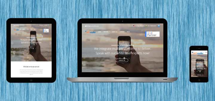
Responsive web design is an approach of creating a website that automatically adjust to fit the size of the visitor’s viewport, platform and orientation. It responds to every movement user make. Thus it reduces your work for a different design and development phase for each new gadget in the market. Now that you have known about the basics, we will next discuss how it works and what are the benefits.
How it works?
Responsive website uses fluid grids, flexible images and media queries. Here is the summary of three main components of RWD:
• Fluid grids: This is also known as liquid layouts i.e. grid system in which absolute units like pixels or points are opposed as they constantly look the same and all elements resize automatically based on the user’s screen. Here we use percentage-based units, each element on the site are sized in relation to one another by proportion rather than pixels.
• Flexible images: One of the most difficult task for responsive web design is resizing images. Setting up the width property to 100%, the image becomes responsive and changes accordingly. Flexible videos are slightly more difficult than images. The HTML5 video maintains its aspect ratio just like images and therefore the same CSS principle can be applied to make them responsive.
• Media queries: This allow the page to use different CSS style rules based on characteristics of the device the site is being displayed on. These might include, but not be limited to the type of display, screen resolution, or display density.
Benefits of responsive web design
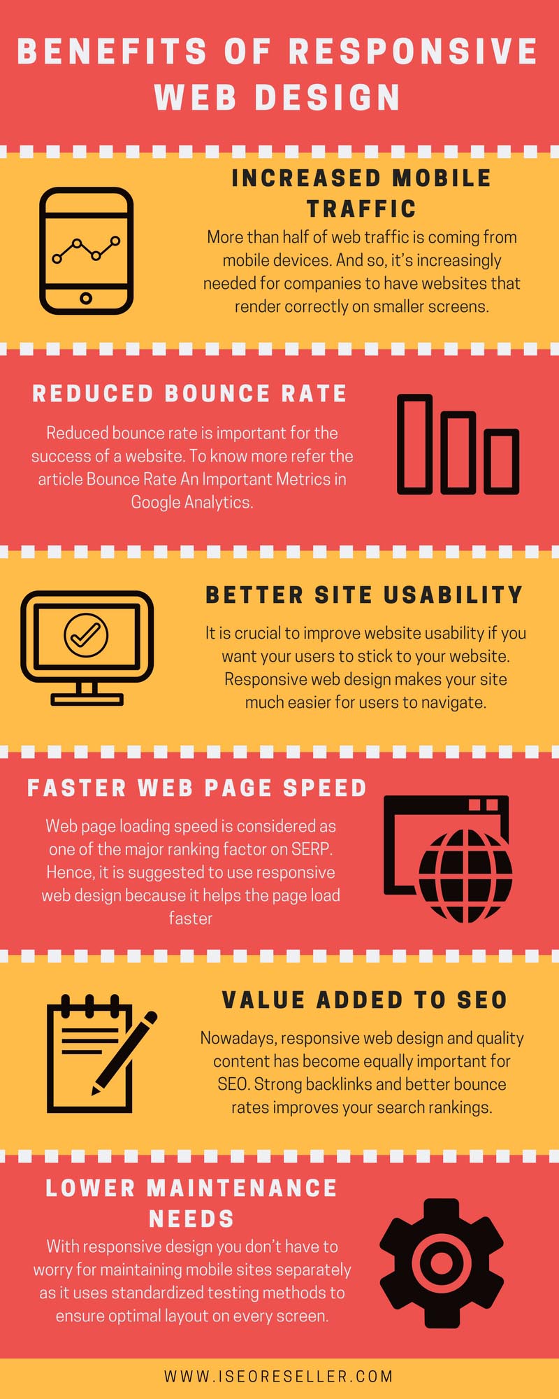
1. Increased mobile traffic: More than half of web traffic is coming from mobile devices. And so, it’s increasingly needed for companies to have websites that render correctly on smaller screens so that users don’t encounter distorted images or experience a sub-optimal site layout.
2. Reduced bounce rate: Bounce rate refers to the percentage of visitors to a particular website who navigate or “bounce” away after viewing only one page of the website. Reduced bounce rate is important for the success of a website. To know more refer the article Bounce Rate An Important Metrics in Google Analytics.
A responsive and optimized mobile site provides a much better user experience for the visitor, it not only places the content but it also presents in the way it should be. Therefore, it is much likely that responsive website keeps the visitors engaged for a longer period of time and thus helps in reducing the bounce rate.
3. Better site usability: It is crucial to improve website usability if you want your users to stick to your website. Responsive web design makes your site much easier for users to navigate. Good Usability not only leads to increased conversion but even Google gives them priority it terms of ranking factor.
4. Faster web page speed: Web page loading speed is considered as one of the major ranking factor on SERP. Hence, it is suggested to use responsive web design because it helps the page load faster.
5. Value added to SEO: Nowadays, responsive web design and quality content has become equally important for SEO. Strong backlinks and better bounce rates improves your search rankings, but mobile optimized website adds value to your site.
6. Lower maintenance needs: With responsive design you don’t have to worry for maintaining mobile sites separately as it uses standardized testing methods to ensure optimal layout on every screen.
Importance of responsive web design
• Users can interact at ease with your site, if it is designed to work with multiple devices.
• Creating a single site that satisfies to multiple devices may in itself require more effort, but if we see it’s another aspect there will be only one site for development and not multiple versions.
• Creating a site that works based on how much can be displayed in a particular viewport is a more effective way to provide content on screen than depending on browser agent strings, which can be falsified and error prone.
• RWD is able to satisfy to future variations. If a site is planned wisely, media queries can be created that provide for devices already in use and ones yet to be released in the market.
Final thoughts
I hope you must have enjoyed the article and have agreed that creating responsive website is a better technique. It is considered best practice besides it saves your time, efforts and money to apt website on different devices either it be your old laptop or the latest gadgets around. Hence, before getting into development process it is crucial to create some form of strategy to understand the requirements and its benefits.
Reference - Top 5 ways responsive web design benefits your SEO